


In this digital-first, fast-paced world, most marketers are focused on digital marketing. However, when it comes to attracting customers to your shop, nothing works better than a sign. Whether you prefer a creative design or something simple, your sign's design will affect your ability to attract new customers.
In this post, we look at some important design principles to consider when designing a business sign.
Colour
The colour palette of your sign is one of the most important aspects to consider. For best results, use compelling colours. That's the sure-shot way to grab the attention of your customers. Whether it is McDonald's yellow or Coke's red, the right colour palette can help establish your brand identity and help you stand out.
When choosing a colour palette, avoid going with the trends. Many small business owners assume that modern, current colours can help them stand out. Be sure to consider the longevity of the colours as well.
You don't want to choose a colour that's in vogue today but will look out of place in the future.
Size
The size of your sign means everything. A larger sign can accommodate larger text, which makes reading easier. This is of significance especially if you are putting up a sign on busy streets or at a distance.
As a rule of thumb, we recommend 10 feet for every inch of text height. So, text with 8 inches of height will have stellar impact at 80 feet, and so on.
The font you choose also affects the readability. Although you may prefer stylish typefaces, it may hamper readability at greater distances.
Contrast
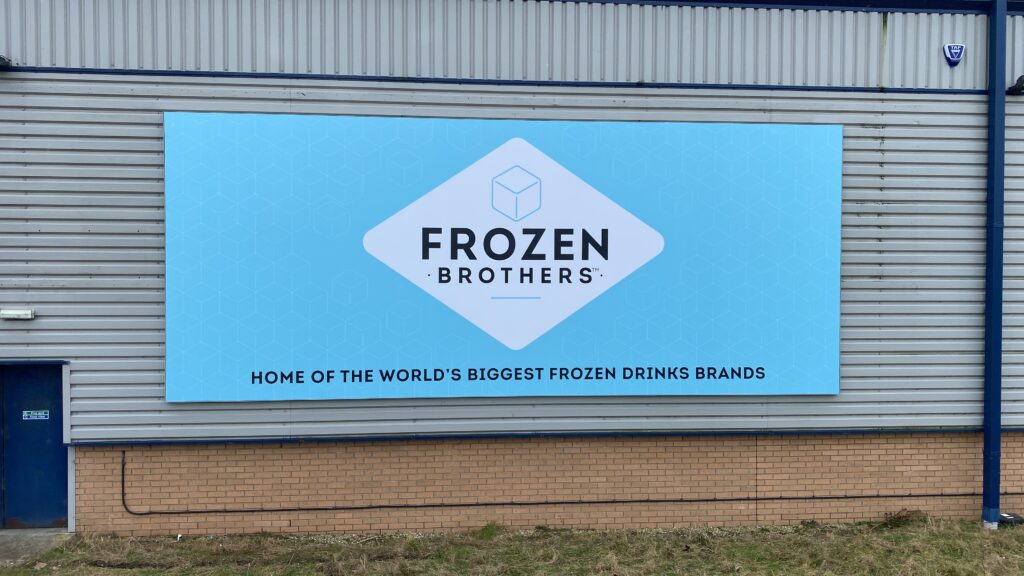
An attractive sign is a great start, but it's equally important to ensure it is readable. When it comes to readability, your sign's contrast plays a crucial role. A sign typically features a continuous background colour with graphics or text in the foreground.
For instance, if you are using a dark background such as navy, the foreground can be in lighter shades of white or yellow. If you pair similar colours, your sign may not be readable.
On the other hand, a weak colour contrast could also be improved by adding drop shadow or an outline around the foreground text. Adding a border around the graphic or text can also boost readability.
Contact Digital Panther for Signage Solutions in Leeds
Ready to build a sign for your business? Here at Digital Panther, we specialise in business signage. With many years of industry experience, we assure you of quality solutions at competitive prices. Get in touch with us to discuss your requirements.